

The iPhone 18 series has not been officially unveiled yet, but the wallpaper conversation has already started. A new wave of concept images is imagining how Apple could style the next iPhone generation, with glossy metallic layers, deep gradients and bold colors designed to look especially dramatic on OLED displays.
These are not official Apple wallpapers, and that distinction matters. Apple’s current public iPhone lineup still centers on the iPhone 17 family, while the iPhone 18 Pro color palette remains in rumor territory. Still, the concepts are interesting because they combine two things that often shape Apple’s launch visuals: the expected hardware colors and a wallpaper style that visually reinforces the phone itself.
For PhonesGate, the most interesting question is not whether these exact wallpapers will ship. It is whether they point toward the visual direction Apple may choose for the iPhone 18 generation.
Key takeaway
New iPhone 18 wallpaper concepts imagine Apple’s 2026 design direction with metallic layers, deep gradients and bold colors. Here is what looks plausible — and what remains unofficial.
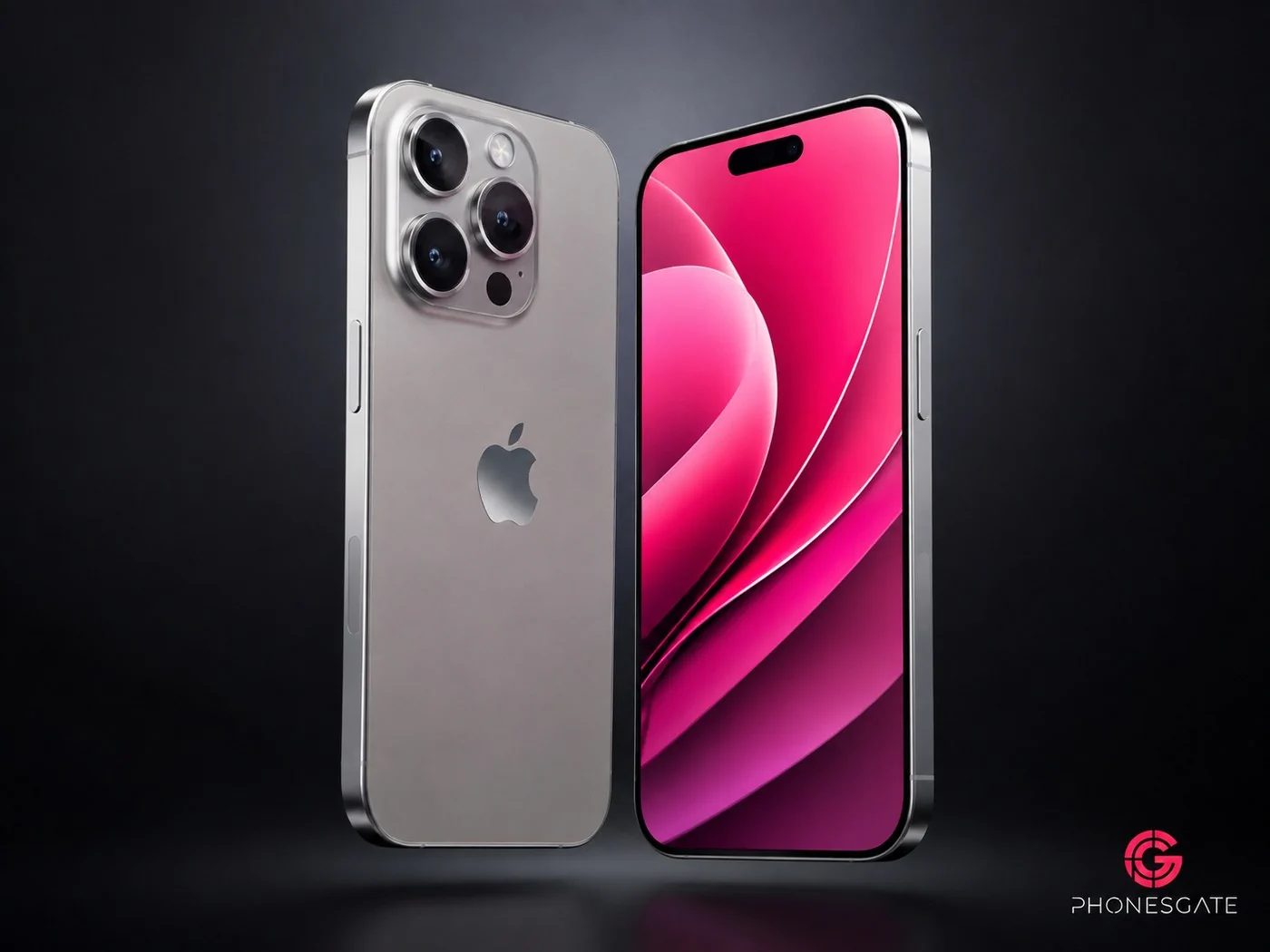
Metallic layers could define the iPhone 18 wallpaper look
The strongest visual theme across recent concepts is a layered, almost architectural design. Instead of a traditional landscape or abstract cloud effect, the wallpaper is built from smooth horizontal or curved shapes with controlled highlights and shadows.
That approach works particularly well on an iPhone because it creates depth without making the Home Screen look busy. The darkest parts of the image can preserve contrast around icons and widgets, while the brighter bands give the lock screen a premium, almost product-render quality.
7 min read
Apple coverage from PhonesGate. Published Aug 8, 2026.
Apple has repeatedly used wallpapers as part of the identity of a new iPhone generation. They are visible in keynote slides, Apple Store imagery, advertisements and almost every early review. A wallpaper that immediately communicates a specific generation is therefore more than decoration; it is part of the product’s visual branding.
Dark Cherry and Light Blue are the color rumors worth watching
The strongest current color reporting around the iPhone 18 Pro models points to a darker red or “Dark Cherry” finish, alongside lighter blue, dark gray and silver possibilities. Multiple rumor roundups have highlighted these shades, although Apple has not confirmed any of them.
That is why a darker red, burgundy or rich pink wallpaper family would make sense as a launch hero look. A wallpaper does not have to match the chassis color exactly. Apple often uses complementary gradients and lighting to make a hardware finish look more distinctive in marketing material.
Light blue is equally believable as a wallpaper direction. Blue has historically worked well for Apple because it can feel both premium and neutral, while also creating strong contrast against a dark display border.
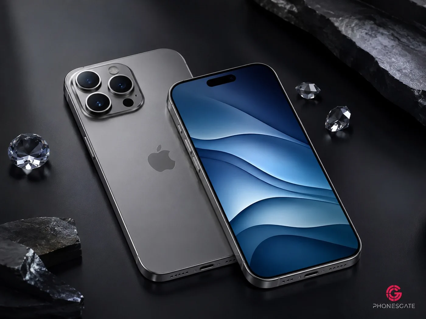
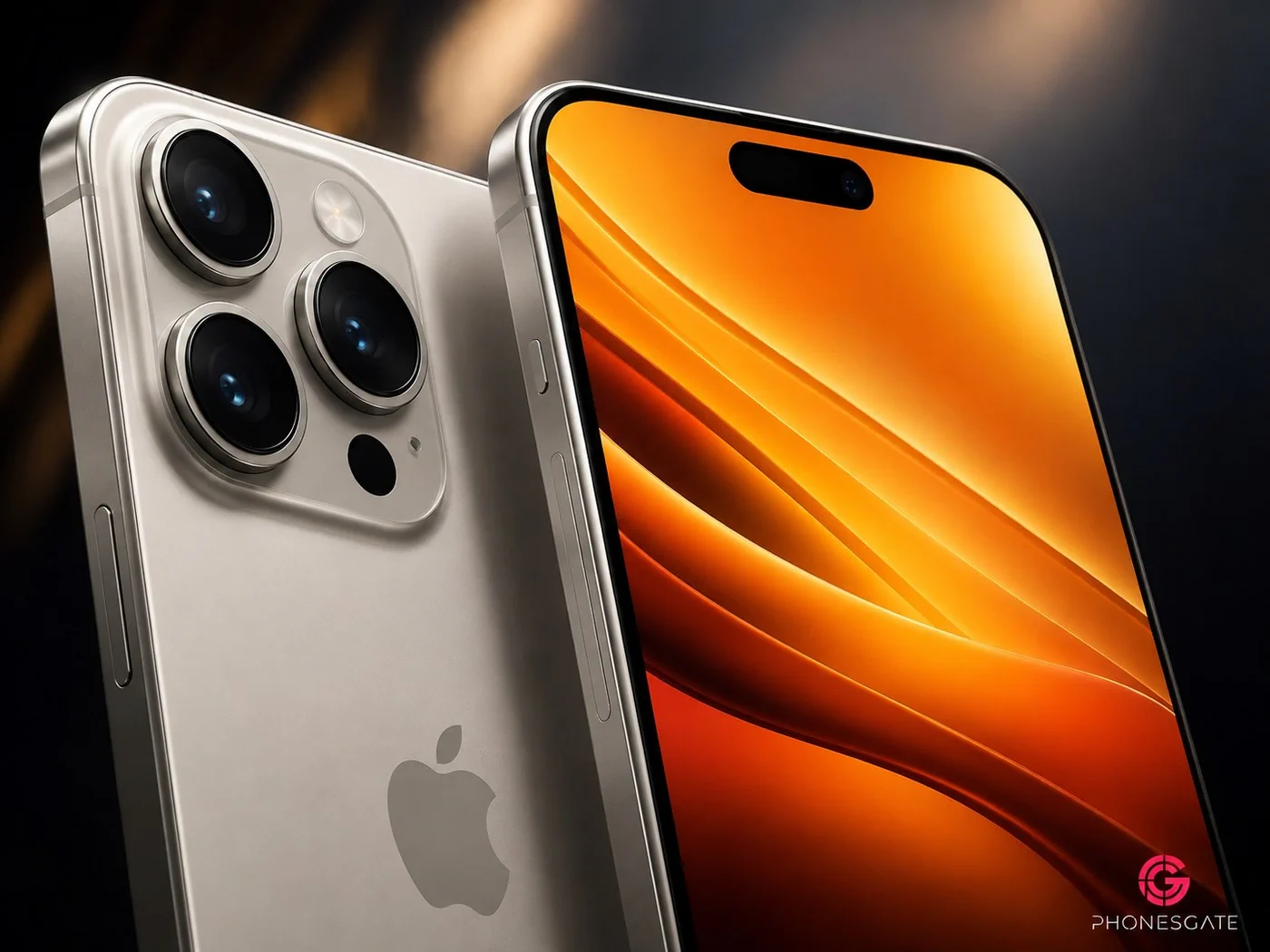
Could Apple go brighter with orange, pink or yellow?
Some of the most eye-catching wallpaper concepts go much further than the current hardware color rumors. Bright orange, saturated pink and yellow versions have been circulating because the layered design responds extremely well to high-contrast colors.
We would not treat those colors as evidence of final iPhone finishes. They are better understood as creative interpretations of the wallpaper style. Apple could use a wider wallpaper palette than its physical device colors, especially if iOS allows users to choose coordinated variants rather than tying one wallpaper to one finish.
An orange wallpaper, for example, can look especially strong on an OLED panel because the deep black shadows around each layer make the bright sections appear almost illuminated. The result is visually aggressive compared with Apple’s more restrained silver and gray hardware options, but it could work well as an optional background.
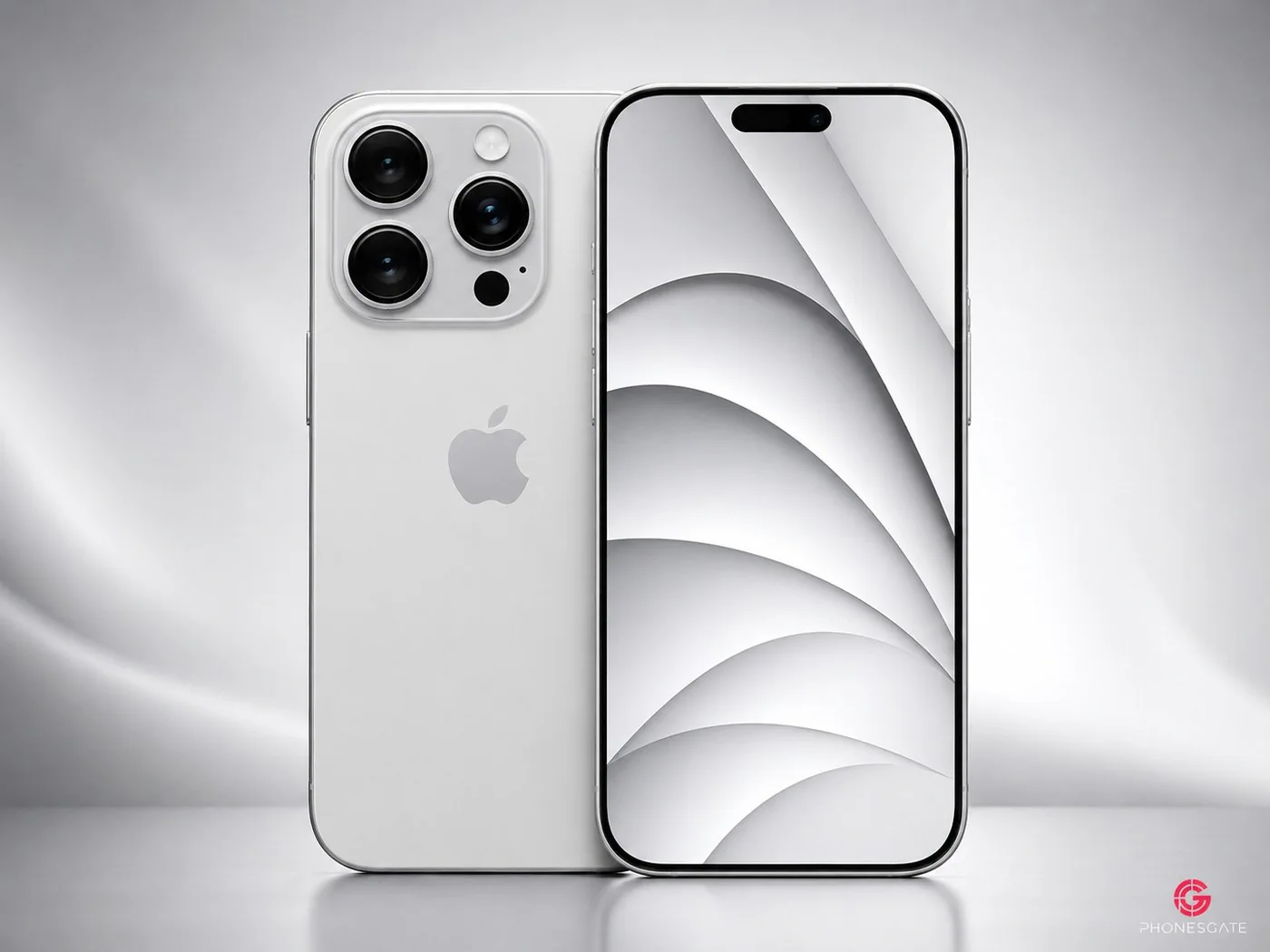
Silver and monochrome may still be the safest Apple choice
For users who prefer the classic Apple look, silver and grayscale concepts may ultimately feel the most realistic. Rumor coverage continues to mention silver and dark gray as possible iPhone 18 Pro finishes, and these colors naturally pair with minimal wallpapers built around white, graphite and soft metallic gradients.
A monochrome wallpaper also gives Apple more freedom to emphasize the hardware. In product photography, a bright silver phone against a clean white or dark gray wallpaper looks instantly premium without competing with the camera design or frame materials.
There is another practical benefit: neutral wallpapers work better with a wider range of widgets, icon colors and lock-screen styles. If Apple continues expanding personalization in iOS, a restrained stock wallpaper can serve as a flexible base rather than forcing a specific color theme.
Why the wallpaper design matters for the iPhone 18 series
Wallpapers are easy to dismiss as a small launch detail, but they influence how a new iPhone is perceived from the first day. The right background can make bezels appear thinner, emphasize a new display shape and visually connect the software to the color of the hardware.
If Apple changes the front design of the iPhone 18 Pro, the stock wallpaper will become even more important. Rumors have discussed possible changes around Face ID and the front camera area, although the final implementation remains uncertain. A carefully positioned wallpaper could help draw attention to the usable screen rather than the cutout itself.
The layered concept style shown here is particularly suited to that job. Its large shapes create focal points away from the status area, while the darker negative space can visually disappear into the display edges.
PhonesGate take: these concepts feel plausible, but not official
The best thing about these wallpaper concepts is that they feel believable without pretending to be leaks. Metallic layers, controlled gradients and color-matched variants are exactly the type of visual tools Apple could use to make the iPhone 18 generation instantly recognizable.
But there is an important line between a concept and a leak. Apple has not released official iPhone 18 wallpapers, and the company has not publicly confirmed the final iPhone 18 Pro colors. The current color reports remain rumors, even when several sources point toward similar shades.
So the safest way to look at these images is as a preview of what could work — not a preview of files that are guaranteed to ship. Dark Cherry and Light Blue currently have more rumor support than the brighter pink, orange and yellow concepts, while silver and dark gray remain the conservative possibilities.
Which iPhone 18 wallpaper would we choose?
For a hero wallpaper, the deep pink or Dark Cherry-inspired option has the most personality. It would give the iPhone 18 Pro generation an instantly recognizable marketing identity. Light blue is the safer premium alternative, while silver is the version most likely to age well over years of daily use.
The orange concept is the wildcard. It is not the strongest hardware color rumor, but it shows how good the layered wallpaper design can look when Apple-style minimalism is combined with a much more energetic palette.
Frequently asked questions
Are these official iPhone 18 wallpapers?
No. The images in this article are PhonesGate concept visuals. Apple has not released official iPhone 18 wallpapers.
What colors are rumored for the iPhone 18 Pro?
Current reports have discussed Dark Cherry or deep red, Light Blue, Dark Gray and Silver. The final names and colors remain unconfirmed.
Will the iPhone 18 wallpapers match the phone colors?
That is possible, but not confirmed. Apple often uses wallpapers that complement the hardware finish rather than reproducing the exact same color.
When will we know the real wallpapers?
The official wallpapers should only be treated as confirmed when Apple publishes the iPhone 18 series or its associated software and marketing assets.