

Seriously — the Google Pixel 10a looks far more expensive than a $499 phone has any right to. The clean proportions, flat satin-finish edges, restrained camera design and almost completely flat rear panel give it the kind of visual confidence we normally associate with much pricier flagships. And after looking through the photos and video used for this article, it is easy to see why the design may become one of the Pixel 10a's biggest selling points.
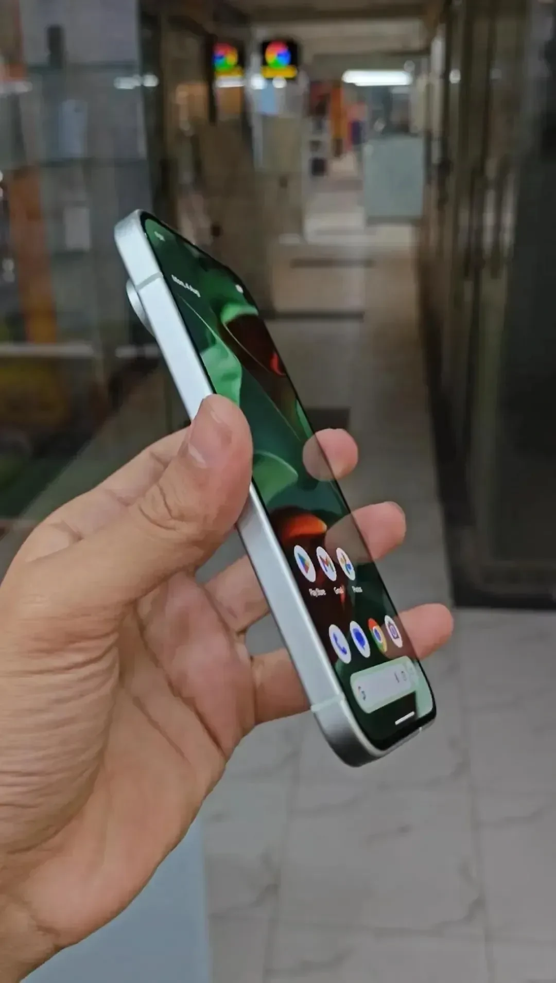
The original reaction practically writes itself: clean design, flat edges, no oversized camera island, and a finish that could easily be mistaken for a more expensive Pixel. The interesting part is that this is not just cosmetic. Google has deliberately simplified the A-series design around a completely flat profile, making the phone easier to pocket and allowing it to sit on a table without the wobble caused by a large camera bump.
That sounds like a small change. In practice, it gives the Pixel 10a an identity that is surprisingly rare in 2026.
Key takeaway
The Google Pixel 10a starts at $499, but its completely flat back, satin-finish edges and minimalist Fog design make it look far more expensive. Here is why Google's simplest Pixel design may also be one of its best.
The Pixel 10a proves that less design can look more premium
Flagship smartphone design has become increasingly complicated. Huge camera islands, polished metal, exaggerated lens rings and aggressive materials are often used to make expensive phones look expensive. The Pixel 10a goes in the opposite direction.
Its shape is simple. The sides are flat, the corners stay softly rounded, and the rear camera area blends into the back instead of dominating it. In the Fog color shown here, the muted green-gray finish makes the design even calmer. It does not scream for attention, but that restraint is exactly what makes it look refined.
9 min read
Google coverage from PhonesGate. Published Sep 19, 2026.
There is also something satisfying about a phone that looks intentional from every angle. The edge treatment is uniform. The front and rear proportions match. The camera area feels integrated rather than attached later. Nothing looks decorative for the sake of decoration.
A closer look at the Pixel 10a's flat edges, display, bottom frame and flush rear design.
The flat edges are doing more work than you might expect
The flat-sided design is one of those details that immediately changes how a phone is perceived. Curved frames can feel softer and more organic, but straight edges give a device a sharper, more engineered appearance. On the Pixel 10a, the satin-finish frame creates a clean boundary around the entire phone without making it feel too industrial.
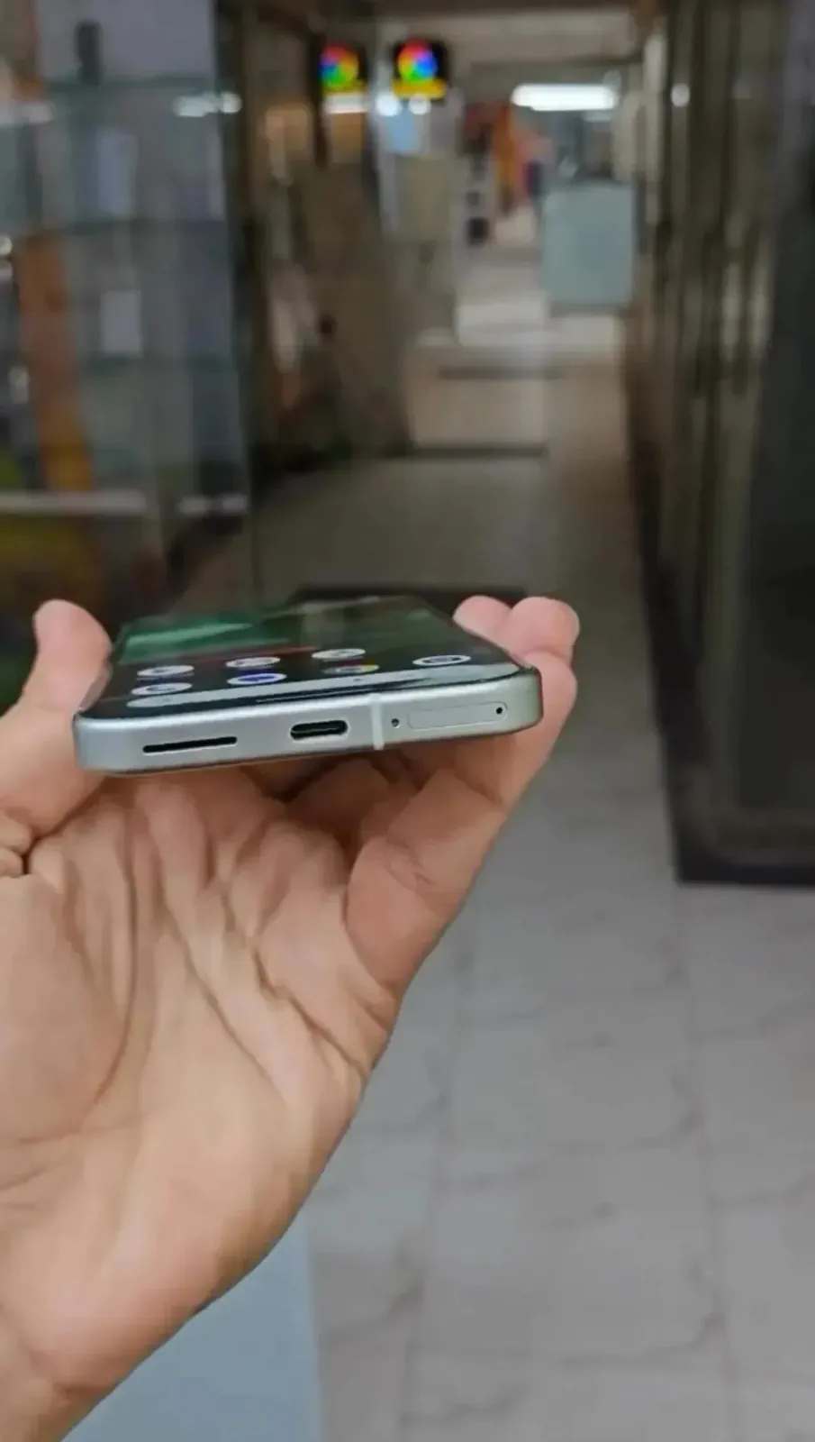
The bottom edge shows just how simple the approach is: speaker opening, USB-C port, SIM tray and antenna lines, all arranged without visual clutter. There is no attempt to disguise the fact that this is an affordable Pixel. Instead, Google makes the hardware feel premium by keeping everything disciplined.
At 153.9mm tall, 73mm wide and 9mm thick, the Pixel 10a is also relatively compact by current Android standards. The 183g weight keeps it substantial without pushing it into the heavy flagship category. That size works particularly well with the flat-edge design because the phone still looks manageable in one hand.
The completely flat back might be the smartest design feature
For years, camera bumps have grown larger as phone makers chase bigger sensors and more complicated optics. The Pixel 10a takes a noticeably different route. Its camera section blends into the rear panel so smoothly that the phone can lie flat instead of rocking on a desk.
It sounds almost old-fashioned, but it is genuinely useful. The phone sits properly when you tap the screen on a table. It slides into a pocket without a large camera shelf catching on fabric. A case does not need to compensate for an enormous raised island. And visually, the back feels cleaner.
This is exactly the kind of design decision that makes a $499 phone feel more carefully considered than its price might suggest.
The Fog color makes the minimalist design even better
The phone in the media set appears to be the Fog finish, one of the Pixel 10a's four main colors alongside Lavender, Berry and Obsidian. Fog is probably the most understated option in the lineup, and that works especially well with the new shape.
Instead of looking like a bright budget color, it has a soft, almost neutral appearance. In different lighting it can shift between pale green, gray and silver. The satin frame complements it rather than creating a high-contrast border.
For buyers who like the Pixel design language but do not want something loud, this may be the color that makes the 10a look most expensive.
The screen is much better than the price suggests too
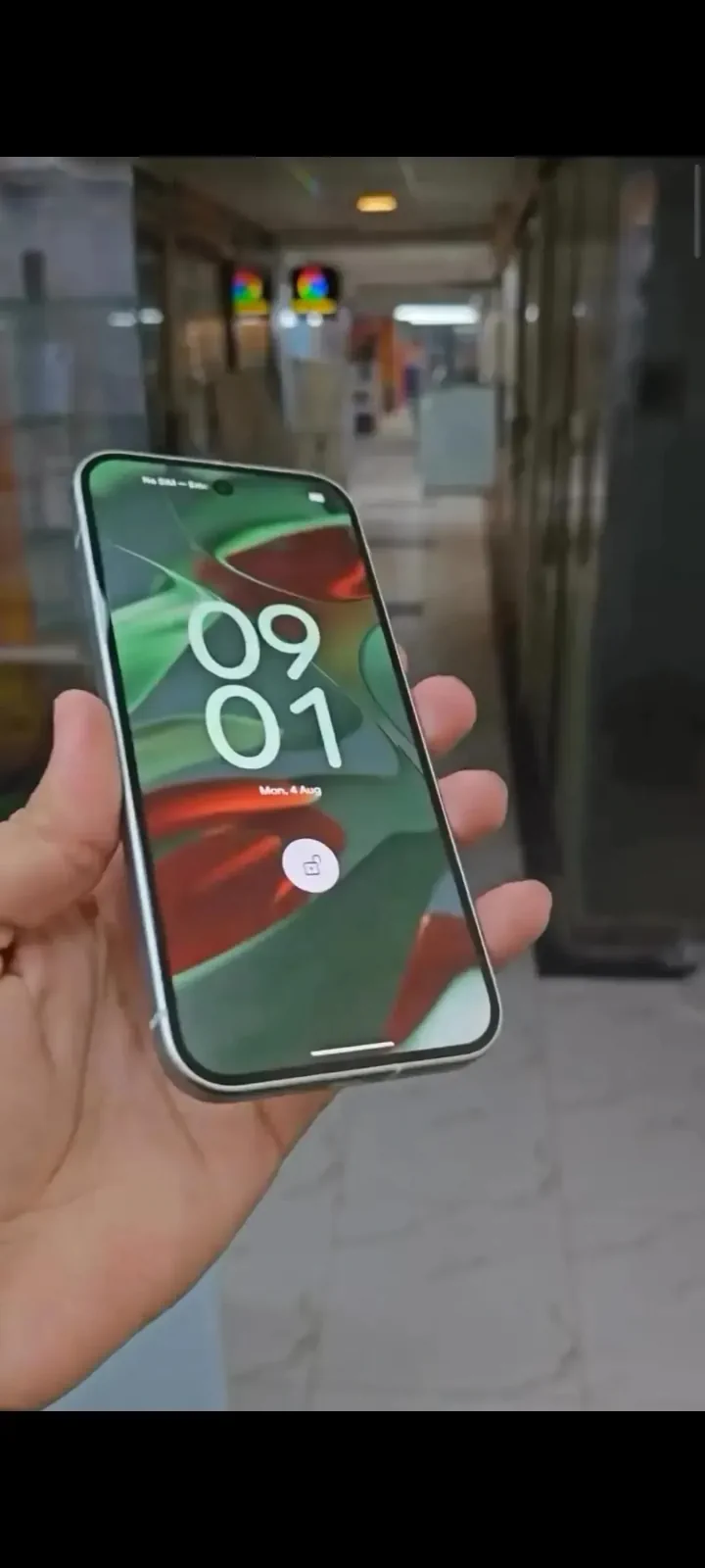
The Pixel 10a uses a 6.3-inch Actua pOLED display with a 1080 × 2424 resolution and a 60-120Hz Smooth Display refresh range. Peak brightness reaches up to 3,000 nits under Google's specified conditions, while Gorilla Glass 7i protects the front.
Those numbers matter because the design would feel much less convincing if the display looked obviously budget. Instead, the high refresh rate, OLED contrast and strong brightness keep the front of the device consistent with the premium-looking exterior.
It is also a sensible size. The Pixel 10a does not chase the giant-screen trend, and that makes the flat-edge proportions look more balanced. For people tired of 6.7-inch and 6.8-inch phones, this may be one of the more comfortable mainstream Android options.
Google kept the price at $499
This is where the design becomes even more interesting. The Pixel 10a starts at $499, which puts it firmly below true flagship pricing. Yet visually, there is very little about the phone that advertises that price difference.
That is the point behind saying it “looks way more expensive than it should.” It is not that Google is pretending the 10a has the hardware of a $1,000 phone. It is that the company has removed many of the cheap-looking design cues that historically separated affordable phones from premium ones.
The satin-finish frame is made from recycled aluminum, while the matte rear uses recycled composite material. It is not an all-glass flagship construction, but from a design perspective, that distinction matters less than it once did.
The hardware underneath is familiar, but still very capable
Inside, Google uses the Tensor G4 with 8GB of RAM and either 128GB or 256GB of storage. This is not the newer Tensor generation used by Google's most expensive Pixel models, but the G4 is still designed around the Pixel software and AI experience.
The more important advantage is integration. Gemini features, Circle to Search, Call Screen, Hold For Me and Google's photo tools are part of the reason people buy Pixels in the first place. The 10a brings much of that experience into the lower price tier without making the device feel visually downgraded.
That combination — flagship-style software with a clean physical design — is arguably more important to mainstream buyers than raw benchmark leadership.
The camera system stays simple
The rear camera system uses a 48MP main camera and a 13MP ultrawide. There is no dedicated telephoto camera, which is one of the obvious ways the 10a remains separated from more expensive Pixels.
Still, Pixel phones lean heavily on computational photography rather than camera count. Features such as Night Sight, Macro Focus and Google's AI-assisted editing tools keep the camera experience more sophisticated than the hardware list alone suggests.
For the audience buying a $499 phone, that balance makes sense. Most people will use the main camera far more often than a niche secondary lens, and keeping the rear design almost flat is a meaningful benefit of the simpler system.
The 5,100mAh battery fits the practical design philosophy
The Pixel 10a has a typical 5,100mAh battery, with Google quoting more than 30 hours of use under its test conditions. Fast charging can reach roughly 50% in about 30 minutes with a compatible 45W USB-C PPS charger, and the phone also supports Qi wireless charging.
Again, none of this sounds extravagant. That is almost the point. The Pixel 10a feels designed around practical features people can actually use rather than a long list of hardware that exists mainly to win comparison charts.
Seven years of updates make the $499 price look even stronger
Google also promises seven years of operating-system and security updates. That is especially important in the affordable-premium segment because the longer a phone remains supported, the easier it is to justify buying it instead of stretching to a much more expensive flagship.
Combined with the durable design, Gorilla Glass 7i and the cleaner flat-back construction, the update policy reinforces the sense that this phone is supposed to age well rather than simply look good on launch day.
Does it actually look better than some flagships?
This is subjective, but the question is fair.
Some flagship phones are visually impressive because they look technically complicated. Large camera modules and polished materials communicate cost immediately. The Pixel 10a takes the opposite approach: its appeal comes from looking calm, balanced and uncomplicated.
For someone who prefers minimalist industrial design, the 10a can absolutely look better than phones costing significantly more. The completely flat rear, compact proportions and soft Fog finish make it feel more like a deliberate design object than a cheaper approximation of a flagship.
That does not make it objectively better. It makes it refreshingly different.
Who is this design for?
The Pixel 10a makes the most sense for buyers who want the Pixel software experience without flagship pricing, but the design expands that audience. It is particularly appealing if you dislike huge camera bumps, want a smaller Android phone or simply prefer minimal hardware.
The phone is also a reminder that “premium” does not have to mean shiny, complicated or oversized. Sometimes premium is just good proportions, consistent materials and fewer unnecessary details.
PhonesGate verdict
The Google Pixel 10a looks far more expensive than its $499 starting price because Google did not try to make it look expensive.
That sounds contradictory, but it is exactly why the design works. Flat edges, a satin frame, a completely flat rear and a restrained camera section give the phone a confidence that cheaper devices often lack. Nothing looks like it is trying to imitate a flagship.
The hardware is sensible rather than extreme: a 120Hz OLED, Tensor G4, dual cameras, a 5,100mAh battery, wireless charging and seven years of updates. But wrapped in this cleaner body, those specifications become part of a device that feels unusually complete for the price.
So yes — we can absolutely see people saying this looks better than some flagships. And for once, that does not feel like exaggeration.
Browse more current smartphones in the PhonesGate device database.