


Source and context
Why Google redesigned emoji
Emoji are no longer used only as literal pictograms; they now carry tone, subtext and nuance in everyday messages. The publication notes shifts in how people express emotions: some emoji that once dominated usage have declined, while others that convey exaggerated or overwhelmed states have risen. This evolution motivated a design refresh of the entire emoji set (3,977 characters) to better reflect modern online expression and readability across contexts.
What’s new in Noto Emoji 3D
The most visible change is a move from flat pixel art to three-dimensional illustration. Rather than pursuing photorealism, the redesign emphasizes expressive, illustrated forms that retain the playful character of familiar emoji while adding depth and dimensionality. The team tested many variants and found user preferences for full-body animal depictions over floating heads, discovered that added props can reduce comprehension, and observed that small changes (for example, the direction of a wink) can alter meaning unexpectedly.
Key takeaway
Google has unveiled Noto Emoji 3D, a redesign of the emoji set that shifts favorite characters into three-dimensional models, improves contrast for dark modes, and releases raw 3D files to the public.
Importantly, the new Noto set is provided as true 3D models. The designers are releasing raw.OBJ files so creators can incorporate emoji into immersive experiences, indie apps or other projects. The open-source approach aims to let the community remix and repurpose the assets in unanticipated ways.
Color, contrast and accessibility
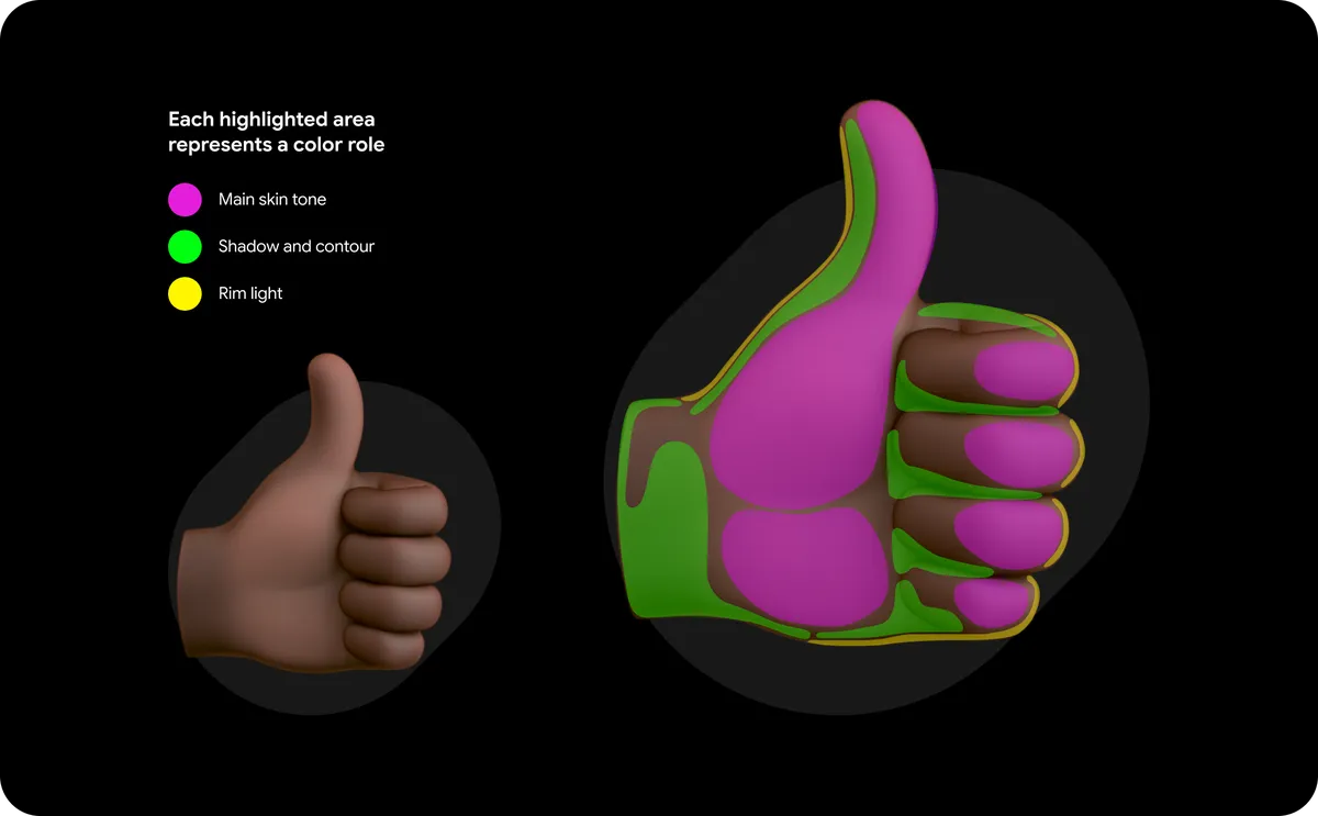
To address visibility issues—such as emoji with the darkest skin tones being hard to see in dark mode—the update includes a pixel-level contrast tool. This AI-powered utility analyzes each emoji, flags low-contrast cases and suggests higher-contrast variants for designers to implement. The goal is to preserve intended skin-tone representation while ensuring legibility across light and dark backgrounds.
3 min read
Google coverage from PhonesGATE. Published Jul 17, 2026.
Why it matters
Moving emoji to a 3D format and publishing raw model files opens new possibilities for how emoji are used beyond chat: virtual reality, augmented reality, stickers, and custom apps can all reuse the same assets. The contrast work also addresses a real accessibility problem that affects everyday communication in dark-mode interfaces. Overall, the changes reflect a broader recognition that emoji function as a rapid, visual language within text conversations.
PhonesGATE quick analysis
The redesign balances familiarity and freshness: keeping the illustrative, expressive identity of emoji while granting them dimensionality and broader utility through open models. Releasing.OBJ files is notable because it encourages independent creators and small developers to reuse official assets without starting from scratch. The contrast tool indicates a practical, user-focused approach rather than purely cosmetic updates.
What this means for buyers
For most people, the change will be subtle: emoji will feel more dimensional and, in some cases, clearer in dark mode. Power users, developers and creators are the primary beneficiaries—expect faster adoption of emoji in immersive apps, custom keyboards, and sticker packs. Users sensitive to accessibility concerns should see improvements in legibility for darker-tone emoji.
Related device context
Expect these assets to appear across keyboard apps and platforms that adopt the new Noto models; Gboard integration and third-party keyboard or messaging apps are likely places where the 3D emoji will be visible first.
Sources and methodology
This article is based on reporting from Google Android, with PhonesGATE editorial context and buyer-focused analysis.